Describe the difficulty precisely
First identify where reading is difficult. Does it affect system menus, one website or a particular document? Is the text small, faint or genuinely blurry? These differences point to different settings. Open a familiar page and document for comparison. Clean the screen according to its maker’s instructions if needed, and reduce distracting reflections. Sit in your normal working position while testing. A setting that looks comfortable with your face close to the screen may not suit your actual seat. Write down which part of the display needs improvement rather than changing everything simply because reading feels difficult.
Use application zoom for a limited problem
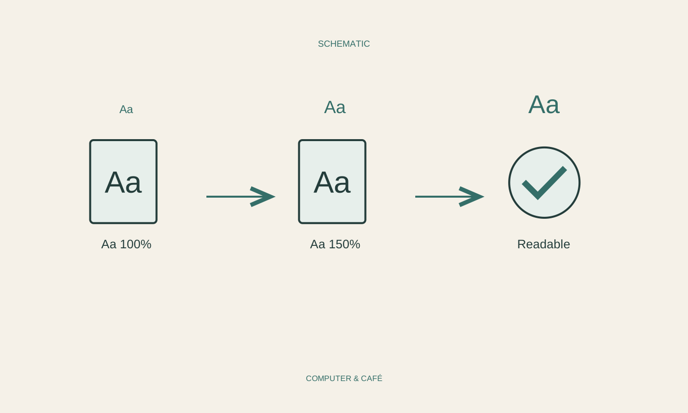
For one webpage or document, the application’s zoom control may be sufficient. Find Zoom or a similar option in its menu and change it in small steps. Observe the whole result. At high magnification, tables may become wider than the window or controls may rearrange themselves. That is not automatically a fault. Check that content remains available and important buttons can still be reached. Record the previous value so you can return to it. Temporary viewing magnification normally does not change the document’s underlying content, but examine print preview separately instead of assuming reading size and printed size are identical.
Adjust the wider system deliberately
If menus, icons and several applications all seem too small, examine the operating system’s display and accessibility settings. Text size and overall scaling may be separate options. Change one first and inspect several typical applications. Different scaling can make sense on multiple displays because physical size and pixel density vary. Select the intended monitor before changing its settings. Prefer a supported, recommended resolution rather than trying to solve small text solely with an unsuitable resolution. Some applications respond fully only after being reopened, so check their behaviour before concluding that a system setting has had no effect.
Choose useful contrast and brightness
Larger letters do little if they barely stand out from the background. See whether another supported application appearance improves readability. Dark and light modes are options for individual preference, not universally superior solutions. Adjust brightness to the room rather than automatically selecting the maximum. Where possible, remove bright light reflected in the display. Also inspect coloured notices and selection highlights. A useful appearance should make more than ordinary paragraphs readable: you still need to identify the active field, selected button and important status information. Test these elements before adopting an appearance for all of your daily work.
Finish with a real reading task
After a change, read several paragraphs, open a menu and complete a small everyday task. Check whether the improvement remains useful for several minutes. Keep the chosen values in a short note, especially with multiple monitors. If one program alone still looks blurry, investigate its current help instead of repeatedly changing the entire system. A magnifier or another built-in accessibility feature may help in particular situations. Persistent visual discomfort calls for appropriate professional attention rather than relying only on computer adjustments. The practical goal is a display that supports your work and can be changed again in an understandable way.
Distinguish application zoom, text size, scaling and contrast, and test changes separately.