Treat headings as a meaningful role
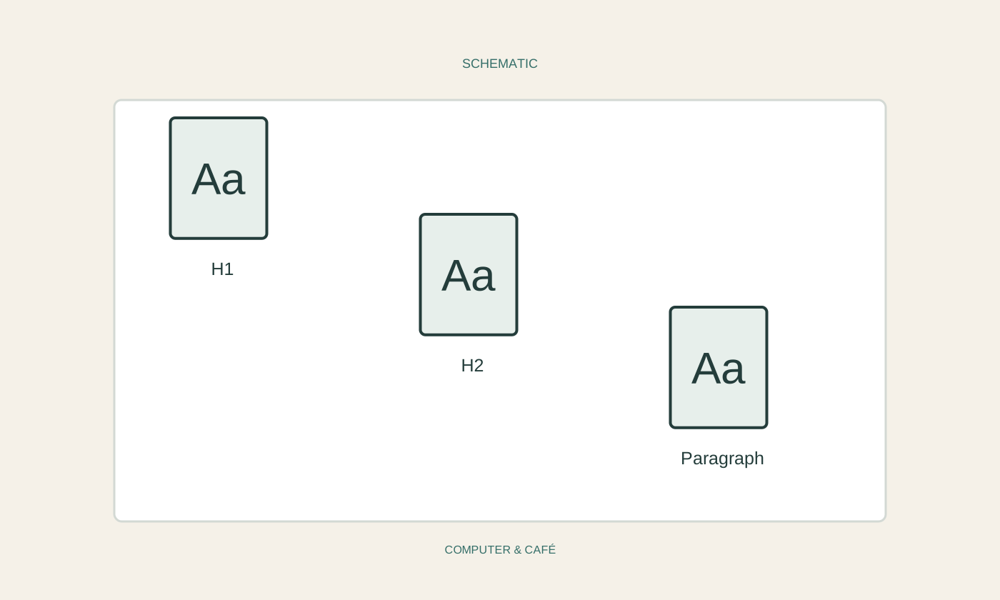
A large bold line may look like a heading without being recognised as one by the application. Apply the intended paragraph heading styles so the role is explicit. A main heading and its subordinate section should use different, logically ordered levels. Choose the level because of the content, not because its current font size happens to look appealing.
Begin with a manageable portion of the document. Apply a suitable style to a genuine main heading, then to a subsection beneath it. Check whether the order makes sense. You do not need to use every available level. A few clear levels are easier to maintain than an unnecessarily deep structure created only because the options exist.
Give ordinary paragraphs a consistent base
Use a common paragraph style for body text. It can control line spacing, paragraph spacing and indentation together. Avoid repeatedly pressing Enter to create space between sections. Those empty paragraphs can move into awkward positions during later edits and make the page arrangement difficult to predict.
If paragraphs using the same style still look different, additional direct formatting may be present. Inspect the specific paragraph before changing the shared style. Otherwise a local exception may prompt a change that affects every correctly formatted paragraph elsewhere. Work on a copy when first bringing a large existing document into a consistent system.
Change one style and review several places
Try changing one manageable aspect of a used style, such as space after a heading, then inspect several occurrences. The benefit is that corresponding paragraphs change together. For exactly that reason, review more than the currently visible page before deciding that the adjustment is successful.
Watch difficult cases: long headings, paragraphs before tables and pages containing images. A setting that suits one short heading may create an awkward break elsewhere. Use the application's intended paragraph and page controls rather than adding manual blank lines until a particular page happens to look right. That accidental layout is unlikely to survive the next round of edits.
Define special cases sparingly
Quotations, captions and notes can have their own styles when they recur. Name them for their purpose rather than their colour. Caption still makes sense after its typeface changes. Avoid accumulating many nearly identical styles distinguished only by an arbitrary size, since choosing between them soon becomes another formatting task.
Pasting material from elsewhere can introduce additional formatting. Check that the intended styles are still used afterwards. Plain text may sometimes be a better starting point, but it needs the appropriate structure applied again. Choose the paste method deliberately and inspect lists, tables and emphasis whose meaning might be lost if everything is simplified indiscriminately.
Inspect the output you will actually share
Save the editable file and review its page layout. A heading should not quietly remain alone at the foot of a page while its paragraph starts on the next one. Also inspect images and captions together. Consistent styles make these adjustments easier but cannot guarantee every page break without a review.
If sharing a PDF, open the actual export and compare several pages, including difficult layouts. Retain the editable source for future revisions. The value of styles becomes especially clear during the next update: you can alter the presentation coherently without revisiting every heading and paragraph individually, while retaining a structure that another person can understand and continue using.
Use styles for meaningful document roles and inspect shared changes in several places, including the final export.